 After more than 40 years with the plainest logo in professional sports, the Cleveland Browns took a bold step to the future on Tuesday by unveiling a new logo that … looks pretty much as plain as before .
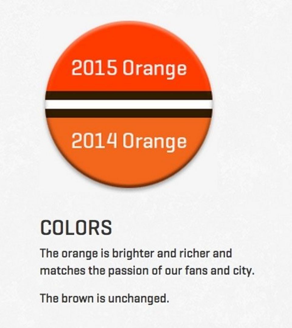
The club kept the team’s helmet as its primary logo and the changes were quite subtle. The shade of orange is different and the face mask is brown. The secondary logo features a snarling dog for the Dawg Pound. Team president Alec Scheiner said the team would continue to use Brownie the Elf as a logo, as well.
The primary focus of the helmet logo, Scheiner said, was honoring the Browns’ tradition and matching the helmet’s structure with the team’s identity. The Browns are still the only NFL team whose primary logo is their helmet. They felt preserving that was important.
“Departing from that would be too radical a departure,” Scheiner said.
The Browns say the orange is “brighter and richer and matches the passion of our fans and city. The brown is unchanged.”
All of it has led to the revolutionary new direction the franchise took today by darkening the shade of a color that’s not even in its name and making the facemask a little different than before. We’re living in a brave new world. No, correction: We’re living in a Browns new world.


